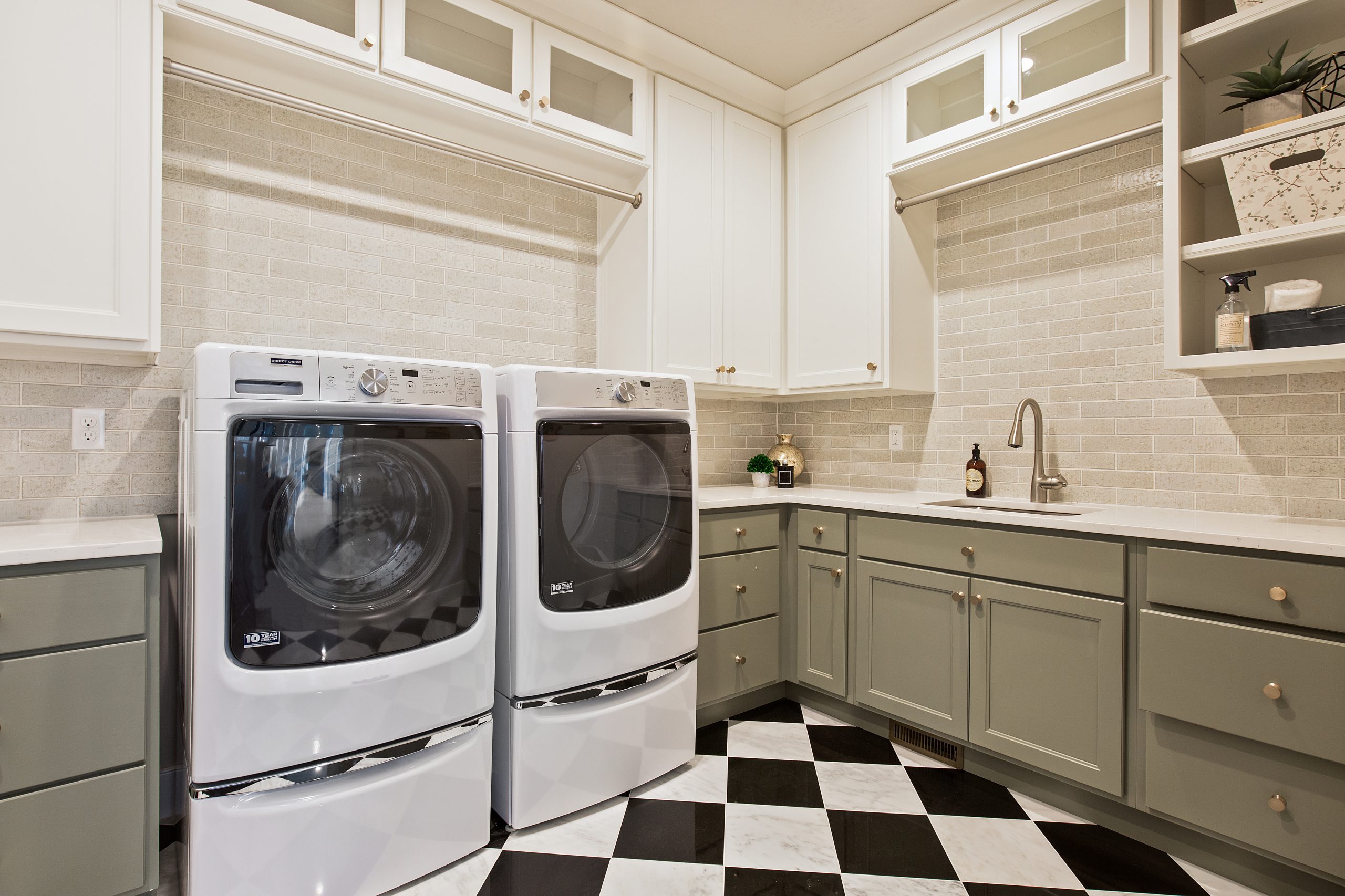
The laundry is no longer the little room under or at the back of the house that you try to hide.
It has become a focal point for modern buyers who want an organized workspace rather than an indoor junkyard of dirty clothes and everyday jetsam that doesn’t have a home elsewhere.
As an average six hours each week is spent with the washer churning away, it is no surprise that architects are integrating the utility room into the design of the home, rather than shoving it somewhere close to plumbing.
Architects are allowing more space for the laundry while interior designers recommend the colour scheme and fittings match those of the kitchen.
An alternative to the so-called “statement laundry” is the mudroom, where you enter the house through the laundry, kick off shoes, hang coats and put away school bags, car keys and so on.
Here, we have focused on styling a statement laundry as these add greater value to your home:
Prioritize storage
Storage is an essential component of a modern laundry, especially if you have a large family. This element must always take priority, or you will never keep on top of the mess. Make sure your cabinetry under the benchtops is easily accessible so the family won’t throw dirty clothes in a corner. If a bedroom sits above the utility room, consider installing a laundry chute.
Keep fittings to scale
Your tub and appliances shouldn’t be so big as to dominate the room. Where space is tight – and that is true for most laundries – choose smaller appliances and basins. If your washing machine has a “soak” setting, then consider buying a smaller tub with a cover that can be part of the benchtop.
One appliance will create space
If you have a dryer, you’ll know how much room they take up, even when attached to the wall. Consider installing one appliance that can both wash and dry. This will create a huge amount of space.
Maximize the utility
In the design stage, embrace the full meaning of “utility”. Make sure you have an ironing station that gives you plenty of room to move with a conveniently placed electrical socket. You should carve out space for sorting clothes before and after they go into the wash, as well as for folding.
Cabinetry and shelving
Cabinetry is an essential component of a modern laundry. Wall cabinets should go up to the ceiling to offer more storage, and reduce the collection of dust and your time spent cleaning. Consider installing a drying cupboard. Open shelving is also in fashion right now and can provide the opportunity to add a few personal touches, including an indoor plant to soften the visual impact.
Countertops for elbow room
The idea that a laundry is simply a metal tub next to a washing machine is long gone. A countertop can sit above front-loaders and dryers, providing extra workspace and clear visual lines that will make the laundry appear larger in size.
Hide the pipes
Every modern laundry will hide away the ugly plastic hoses attached to in-wall taps. This subtle attention to detail will give the room a cleaner appearance. Ask your plumber to install flood-stop valves that will shut off the water if a hose blows or splits.
Color is your friend
A laundry doesn’t have to be all-white, although that’s still a popular approach. Consider punctuating the white of the washing machine and basin with a timber or laminate benchtop that will bring the room to life. A light or blond timber can look sensational in all-white surroundings. Colored or pattern tiles for a splashback are also in vogue. Soft greens and blues – colors of nature – are popular and distract from the mundanity of the room’s purpose.
Keep in-synch with kitchen
Don’t overdo the colors. The most powerful make-overs will complement the color combinations in the kitchen. For potential buyers of your home, this will provide an important sense of uniformity. In feng shui, everything should come in pairs. So, creating visual cohesion between your utility room and kitchen means they’ll be a perfect match.
Floor tiles
The impact of clean white or pattern tiles on a laundry floor can be striking. However, your laundry will need to be reasonably large to carry off a patterned tile. In smaller rooms, it can look busy and make the room feel even smaller. Also, consider off-white tiles as the grout will lose its brightness over time and become grey. With white tiles, the floor can quickly look soiled – the exact opposite of the effect you’re seeking to achieve.
