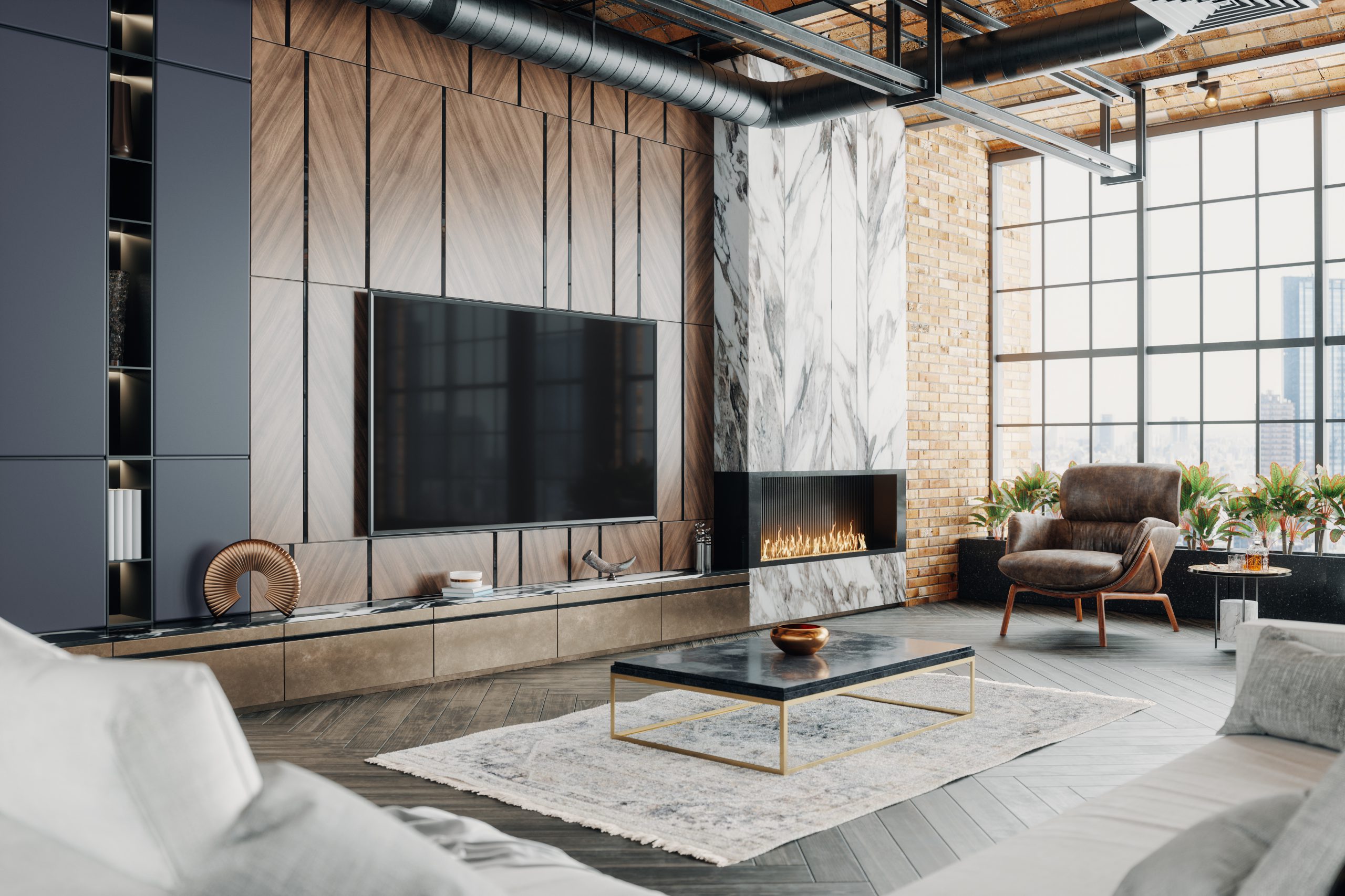
One of the best strategies to maximize the value of your home once it’s on the market is to “stage” it.
Staging a home involves removing most if not all of your furniture and replacing it with pieces that are selected to show off all the attributes of your home.
You can hire a specialist company to do this for you. While you put your belongings in storage or move them to your new home, they will select each piece of furniture, plus artwork and rugs, and rent them for the duration of the marketing campaign.
If that’s a little beyond your budget, you can stage your home yourself. This will likely require you to store some of your creature comforts and undertake a major declutter to get the result you want.
As experienced local agents, we’ve worked with owners who have done an excellent job of staging their home. There’s no doubt this level of preparation pays dividends. It can attract the highest number of prospective buyers and achieve the best possible price.
Below is a list of eight pro-tips to help you stage your home.
Pitch-perfect
Staging is a time to put yourself in the mindset of a buyer, and step away from your own emotional commitment to your home. Who do you want to buy this property? Are you going for a professional couple or a family with teenagers? This will influence which rooms to emphasise like a home office or a kid’s bedroom. Talk to your agent about who your likely buyer might be.
Be sassy, not dull
Playing safe is a good strategy when staging your home, but you can fall into the trap of being boring. Neutral tones become bland quickly, so add splashes of colour using rugs, cushions and wall hangings.
A picture tells a 1,000 words
It’s a cliché because it’s true. So, always consider how your staging will look when it’s photographed. Your home must look absolutely amazing when buyers surf the property websites and jump out. The best shots have a focal point, such as a fireplace, swimming pool or access to a beautiful garden so think about what makes your home ‘Instagrammable’ and look for opportunities to create Instagram styled shots.
Keep it in proportion
Furniture and art should all be in balance with the size of the rooms. If they’re too big for the space, the rooms quickly become small and appear cluttered. That’s a big buyer turn-off. An oversized couch for the living area is the most common mistake. You may need to store your furniture and buy in some lighter pieces.
All square
Watch out for the angles at which you place your furniture. In photos, make sure the furniture doesn’t appear placed awkwardly.
Let there be light
The perception of size increases substantially with great light. Never put furniture in front of windows, and always pull the curtains right back. During walk-throughs, always have the lights on. Feature lighting, especially in the kitchen and living areas, captures the imagination of buyers.
Rug up
Everyone loves a beautiful timber floor in an open-plan design, but it can appear bare and uninviting in photos. So, use rugs to add colour, texture and atmosphere.
Don’t be fussy
Keep ornaments and knick-knacks to a minimum. In fact, now is a great time to box them up ready for your move. They tend to make the home feel busy and cluttered and can leave a detrimental impression of the size of the home.
