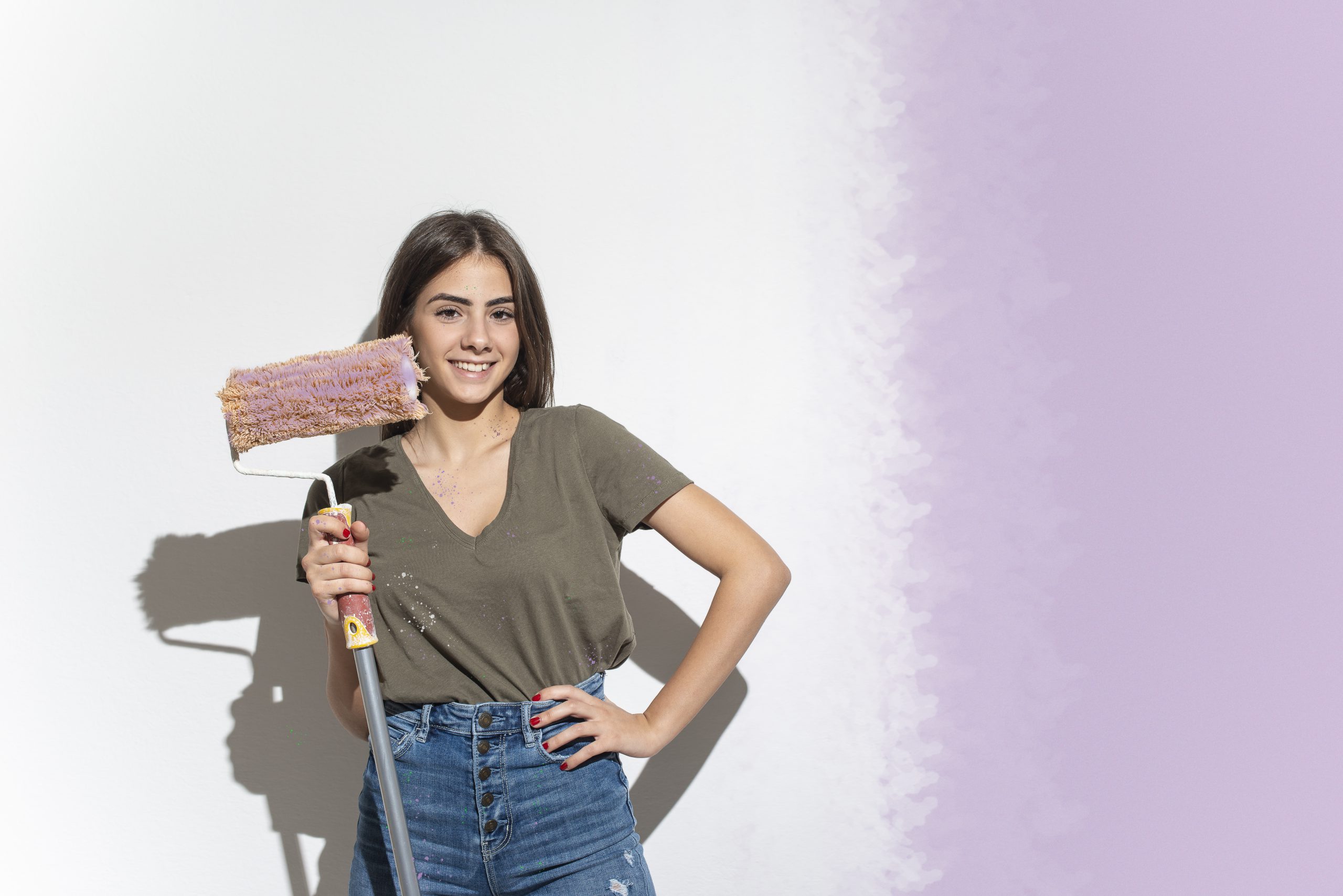
It may not be one of your New Year’s resolutions (and how are they going, by the way?) but you’ll likely lift a paintbrush in anger before 2022 is finished.
There’s always one room in your home that needs a little more attention than the others, or you want to change its purpose. Perhaps you want to turn the spare room from a dust trap into a home office for yourself or a playroom for the kids.
Whatever your objective, it’s likely you’ll start to think about how you can transform the room with a splash of colour.
If you’re feeling creative, it’s a great idea to investigate the fashionable colours of the day and see whether these might be suitable for your project.
In the world of interior design, each year begins with the experts offering their choice for Colour of the Year. Here’s what they say for 2022 (Heads up – green features a lot):
Very Peri
This is the choice of colour kingmaker Pantone. The company describes it as a periwinkle blue with red undertones. You’d be forgiven for thinking it’s purple.
Back to nature
Many colour pundits have selected a hue of green, encouraging you to embrace nature and give the interior of your home a natural flow into the outdoors. Paint company Benjamin Moore is on this bus. Its October Mist is a soothing, silvery green. It says it used the colour of sage for inspiration.
Evergreen
The huge paint manufacturer Sherwin-Williams has taken a similar path, nominating a green it calls Evergreen Fog. Pictures on its website illustrate its perfect match with wood and the browns of natural leather. Sherwin-Williams operates the Wattyl brand in Australia and New Zealand.
Mexican mix
Let’s stick with green but call it guacamole. This hue is a little more in your face and comes from America’s second-largest paint manufacturer, Glidden. The firm is owned by PPG Industries, which offers the Bristol and Taubmans brands in Australia and New Zealand.
Down to earth
The American paint store chain Dunn-Edwards favours earthy brown tones for 2022, calling its candidate Arts & Craft. It’s darker than the favoured greens but doesn’t stray from the back-to-nature theme.
Bet each way
The British paint and wallpaper specialist Farrow & Ball has selected a bright yellow it calls Babouche. It’s a bold choice, but the Brits have tempered their commitment by also nominating Breakfast Room Green. This is “our most cheerful of all our greens”, they say.
